The Startup Life Podcast Art
Overview
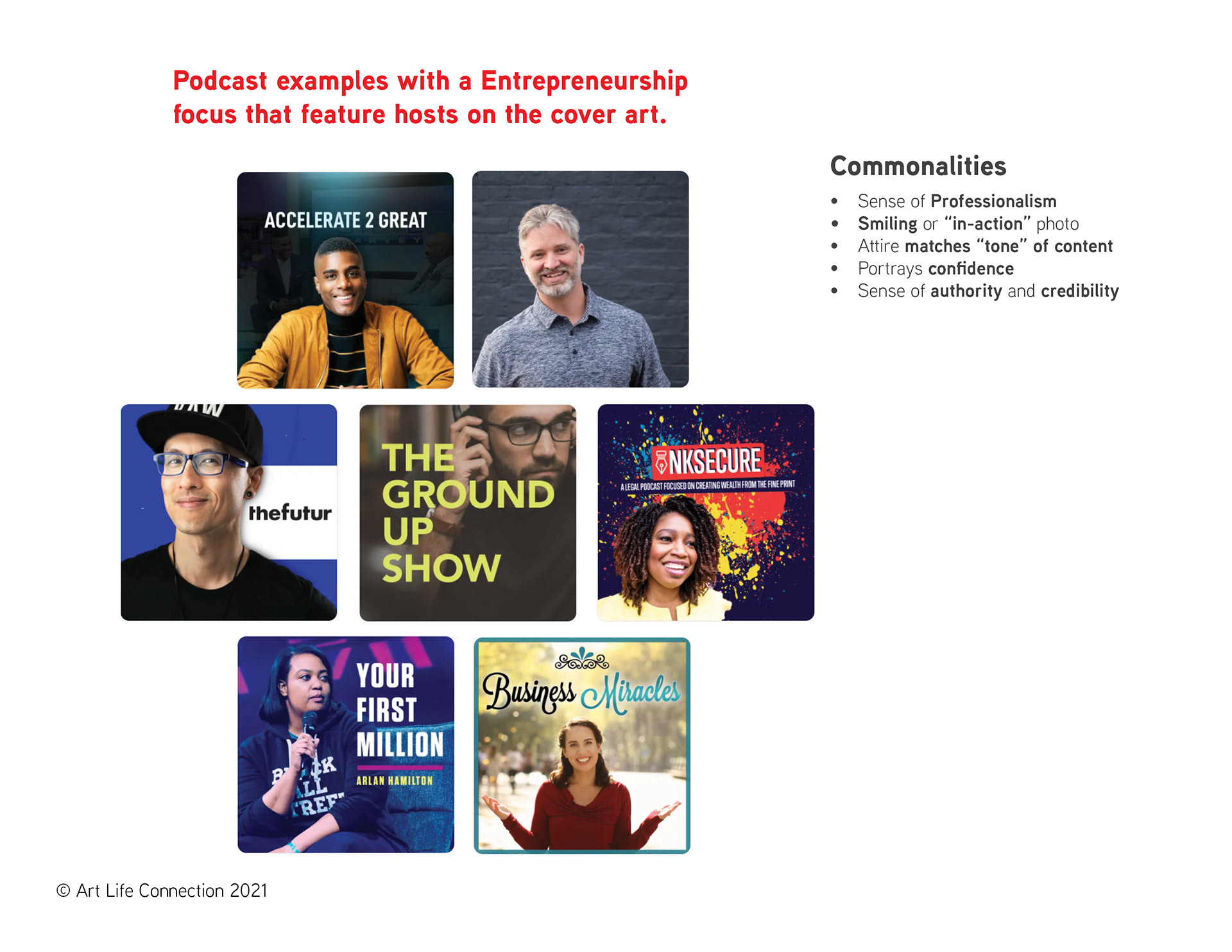
The Startup Life is a podcast that covers topics ranging from “assets to zen-like focus and everything in between so entrepreneurs get the information they need.” The show features seasoned entrepreneurs that have been profiled in major publications. Listeners can take advantage of excellent show notes with links to additional resources and tools to grow their businesses or scale the corporate ladder.
Dominic Lawson, the host of The Startup Life is very detailed in the researching of the guests that are featured. He researches content about their background or their industry or books that they have published in order to ask the pertinent questions. He has a way of getting guests to share valuable information.
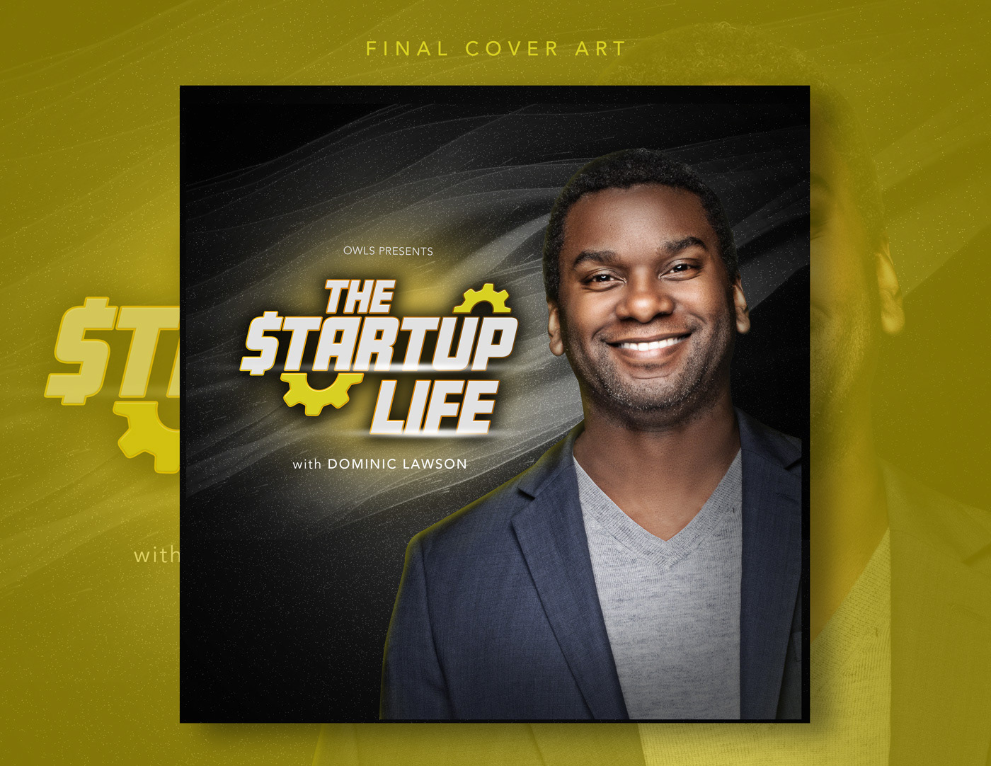
Dominic inquired on whether he could be missing an opportunity to connect with his audience by not having an image of himself on the cover. Depending on the brand, this is something to be considered. Some brands are content-focused, and what is most important is the content as opposed to who is delivering it. Then there are other brands where the reputation of the content creators involved are intrinsically tied to the brand, giving a more personal approach and adding value to the brand.
Original Artwork
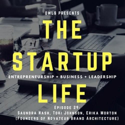
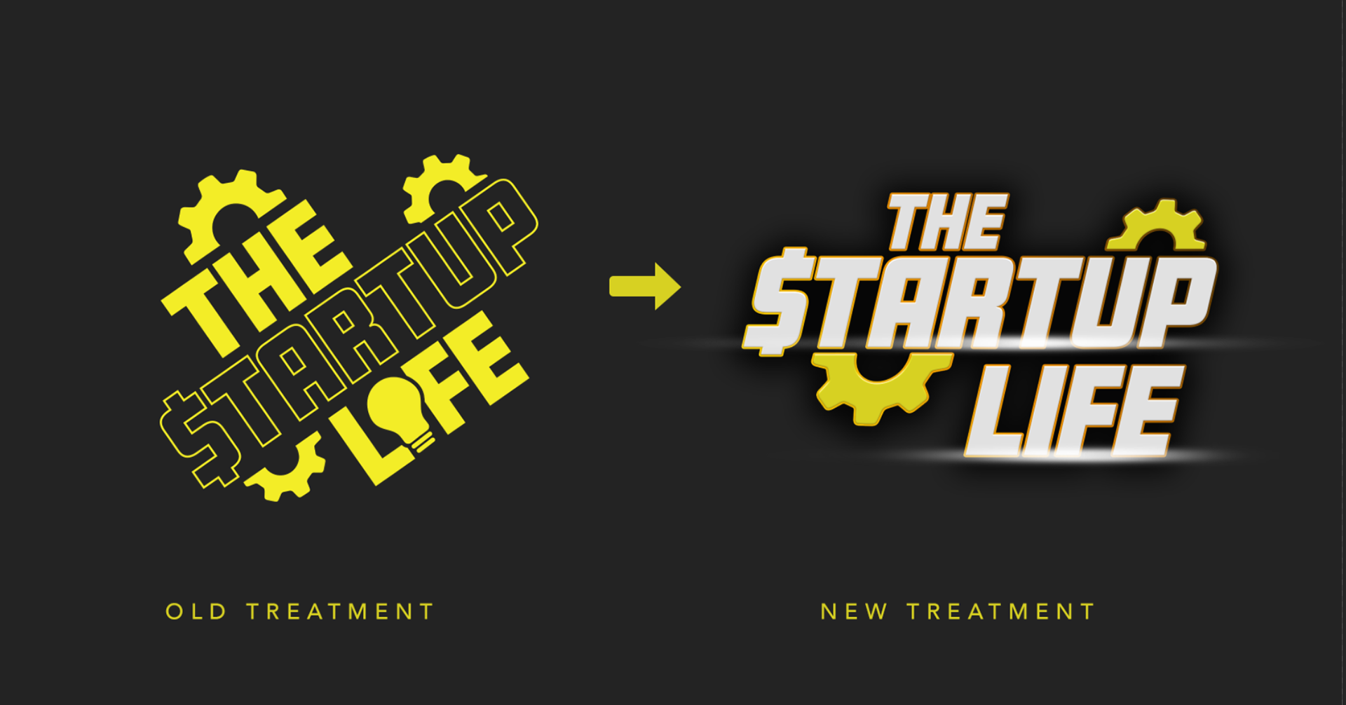
Two earlier versions of the podcast cover art; Left: Original Cover Art for the Podcast created by Dominic Lawson via Canva. Right: An updated Cover with Typographic Treatment for the title.
Process
After a brief review of the history of the podcast and auditing previous artwork. Some guidelines had to be established as far what industry commonalities are and the direction that was to be taken.
Photography
One of the basis for a project such as this where there will be an emphasis on photography is to have photography that is is high-resolution and creates a basis for the aesthetic and photography treatment. In this case Dominic already had a great photo professionally done that he wanted to use.
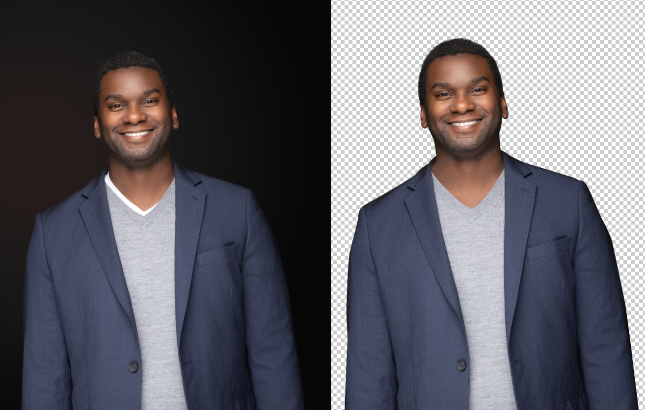
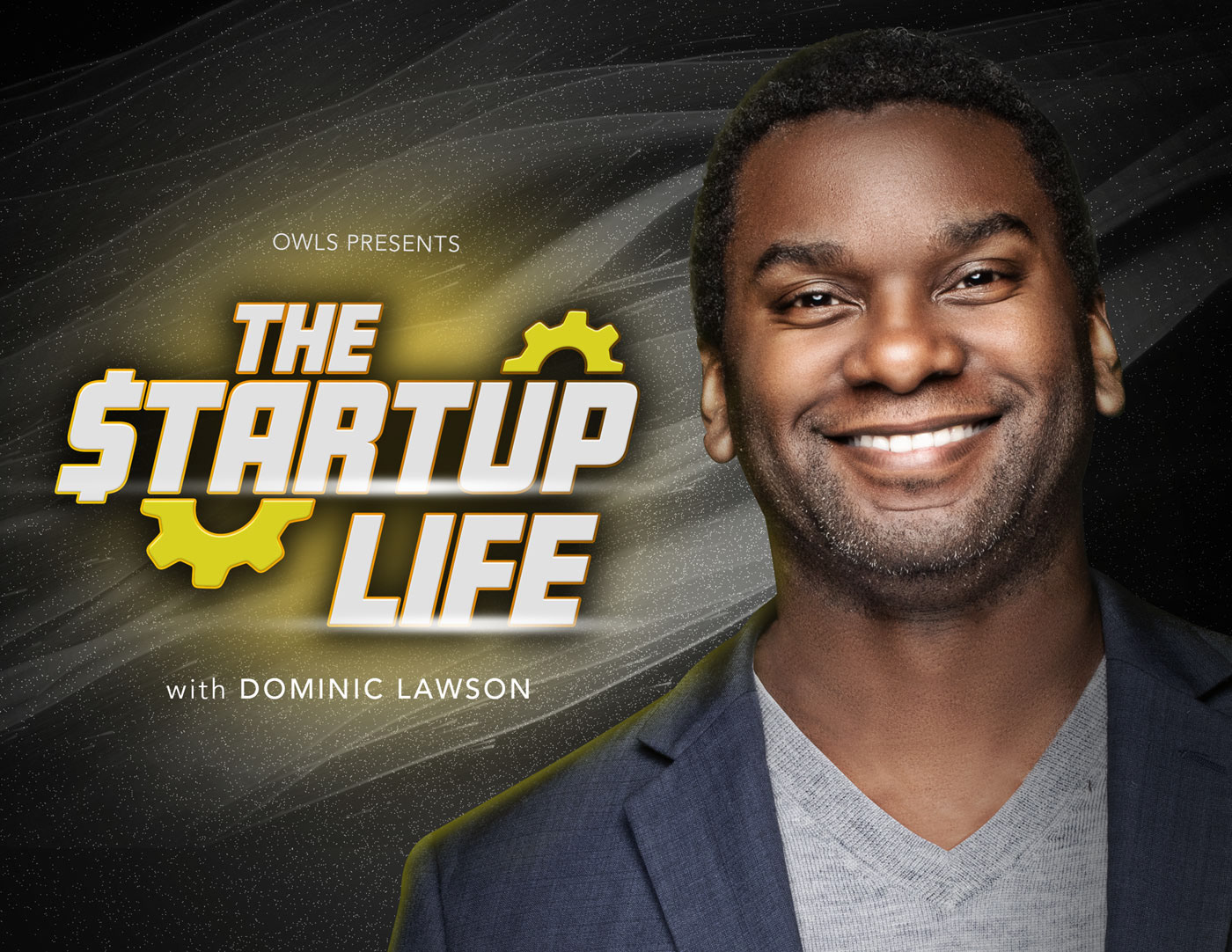
First the initial photo came with a dark background. For the aesthetic we were going for, we needed to isolate the image.
Next, some slight touchups needed to be made to the isolated image. This is where you would want to pay very close attention to details. Any unwanted marks, blemished, or disheveled clothing, or anything that may appear to be awkward should be edited (see the collar of the shirt from previous image comparison). Also, the original photo had a slightly soft focus. I sharpened the details and brightened the lighting on his face. (see image comparison of original and edited)

Left: the original photo; Right: Edited photo for sharper contrast and touchups from isolating image.
Type Treatment
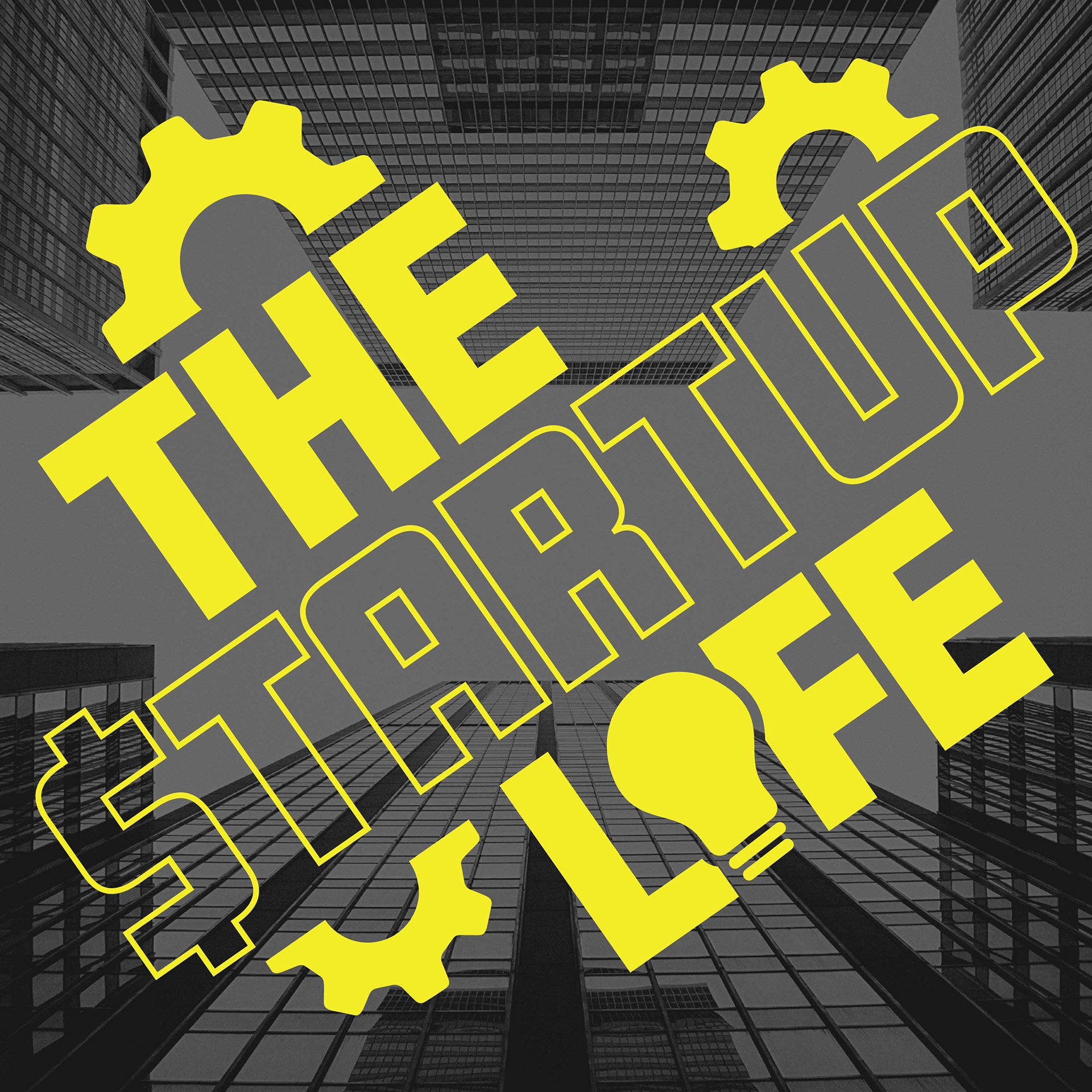
I determined that an update to the type treatment was needed. The old treatment is a prevoius treatment that was used on some Startup Life Apparel. The outline type looks great on T-shirts. For the podcast cover, I thought something a bit more bolder would fit with the aesthetic. It's just a facelift, not a complete change, the same fonts and original concept remain.
Concepts
Dominic was presented with a few different directions for the cover. All the directions focus on aspects of creating a sense of credibility, confidence, and professionalism. Various treatments of typography were presented as well as treatments to the photography.